Wednesday, January 27, 2010

Typography for Children -- Jan 27, 2010


Typography for Children

It's hard to believe that a common practice such as children's typography would take well over 60 years to reach full dominance. In many instances, great things must take time, so it would be safe to assume that anything higher than great would take longer.

What makes this all the more intriguing is that the text used in early children's books rarely matched the child-like sensibilities that the accompanying illustrations had. It wouldn't be until AFTER post-WWII period artists and illustrators finally reconsidered audience selectivity and did their parts in solidifying their role in the evolution of this monumental typeface.

The books with such major changes in the text initially became very hard to come by, as many collectors - not children, as previously thought -- wound up with the books that might eventually nab them millions.

Over time however, such books became more widely published, due in part to the resulting success of the 'experiment.'

These 'experiments' eventually gave way to more research as certain anomalies in typeface composition started to influence the

From 1950 to the 80's children's books benefited greatly not only from the typeface but by the developments in the actual illustrations in the books themselves. Renowned progressive artist Leo Lionni sia d it best claiming that "typography should seen and not heard, because reading is functional and should not be tampered with." Simply put, it shouldn't matter what type is used because it's the overall pictures that children are most captivated by.

Reaction: I was unable to locate the actual images in the article,but I did manage to find some creative uses of typography
nontheless. It seems almost as if many heard Lionni said and took notice. Each picture has an example of uniqueness and thinking outside the box, two qualities that I admire in all art forms.


Images:
-Flash Gordon: a. Ross MacDonald. illustrator, old-fashioned letterpress typography, prints and binds movie props using traditional methods.
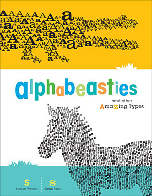
-Alphabeasties – A new children’s book featuring illustrations of animals formed from letters. Designed by Sharon Werner and Sarah Forss from Saint
Paul, Minnesota’s own Werner Design Werks, Inc. (via Howmagazine)

-Scary Halloween Books - one of the artists (unknown name) first forays into Illustrator. Not bad.

Tuesday, January 26, 2010

The Swastika -- Jan. 26, 2010


The Swastika There likely is no other icon associated with so much fear and hatred in the world than the swastika. Interestingly enough the swastika was never intended for such a dubious purpose. Having the distinction for being associated with hatred the logo is also the oldest known to man. The overall design is also known as a sun-wheel, getting its name from the Sanskrit word svastika, meaning "well being." Initially seen as a peaceful symbol the cultural identity behind the design permanently changed in the early 1920's when Adolf Hitler adopted the design/emblem as the logo for the National Socialist Workers Party (aka the Nazi's).

Long after the end of the Na
zi era in 1945, the symbol would never be able to shake off the stigma it had received. The only way this could ever be possible is if one were top rewrite history eliminating easily one of the most controversial icons known to man. There have been attempts to revitalize the swastika as a more peaceful sign as evidenced by the depictions below, one being an non-Nazi swastika and the other part of a sign used in an attempt to stop the E.U.C. ban on the use of the icon (artists/date unknown).

In my opinion however, having links to Judaism, there is no way this once simple design could ever dissociated with the horrors Hitler partook in, no matter what direction it spins nor colors used.

The Peace Symbol -- Jan 26, 2010

The Peace Symbol One of the most recognizable icons of the 20th century, the peace symbol has had quite the following for decades. Popularized during the mid-1950's around the same period when the H-Bomb was invented, the believed originator of the icon itself has been tossed around for decades. Intended to be a composite of the letters "N" and "D" the overall form resembles that of a runic symbol. The runic symbol appearance is of great interest as during the reign of Nazi Germany the vast majority of runic symbols directly (in one way or another) related to Hitler and his army. Touching on the Hitler notion, one must also realize that signs and symbols can easily be transformed to mean good OR evil, so it's also possible that the icon could used for bad, although very very unlikely.

Over the years the overall design of the icon has remained intact, however since creativity knows
no bounds the logo has been altered various times giving new meanings a
nd interpretations to the design.

As with many icons the peace sign has been used for commercial purposes as well. Notable items include wall clocks, tote bags and necklaces, and other forms of jewelery. These interpretations of the icon in my opinion often breathe new life into something that otherwise could be forgotten if not for the history and nostalgia attached to the design already.


Monday, January 25, 2010

Cooper Black Iconography


For this exercise I chose the Cooper Black font. Originating in the early 1920's this font has since become of the most familiar fonts available. In coming up with the icons, I chose to remain strictly with images from the time period this font was created, specifically the years of 1921 and 1922. This proved to be more challenging than initially thought as the majority of these images took much research. In creating the iconic counterparts, the process proved to easier, using straight edged letters such as "I" and "T" for the the sled and more rounded letters such as "O," "C," and "B" for the record player and telephone respectively.

Monday, January 11, 2010

Paper Bomb: Design/Research Post -- 1/11/10

Paper Bombs:

The use of leaflets during wartime has been a vital tool for many decades. Many such posters are used for propoganda, attempting specific parties to side with one side or the other.

Such posters are not limited to the United States either, these "Paper Bombs" have been used in a multitude of nations, including the Japanese, evidenced by the image on the left (artist unknown).

These leaflets were also used for the U.S' benefit during the Cold War. Routinely dropped during maneuvers by the Defense Department in an effort to show troops what they may expect under real combat situations. Included but not necessarily limited to, they fell under four types of messages:

a. Leaflets dropped by the U.S. forces on the enemy.
b. Leaflets drooped by the simulated "aggressor" on the U.S. Army
c. Leaflets distributed by the aggressor designed to demoralize U.S. troops by focusing on their
daily deprivations
d. Leaflets designed by the aggressor to terrorize U.S. troops.

Images:
a. “Give me four years’ time”, 1937 Nazi photomontage used in Iron Fists
b. Form of Soviet Propoganda - Artist/Date Unknown
c. Untitled Nazi Propoganda


Simpllicissmus: Design Reading/Research 1/11/10


Simplicisssimus:

German magazine published weekly from April 1896 through 1967, with a hiatus from 1944-1954. Upon 1964, the publishers decided to rethink its strategy becoming a biweekly in 1964.

Combining brash and politically daring content, with a bright, immediate, and surprisingly modern graphic style, Simplicissimus published the work of writers such as Thomas Mann and Rainer Maria Rilke.


Examples:

This anti-clerical cartoon is another image that was posted in the Simplicissimus at another point in time, the artist(s) at this point are unknown.

Also known as dr Simpl (German name) was one that was routinely used for news and propoganda purposes, until the acquiring of this art movement but not until it was utilized solely as a propoganda item in relation to German forces.

The image on the right is another from this movement, that of which is from Rudolph White, these three images are similar in that they are exhibited within the same artistic movement, however each illustration became detailed as time went on. The details in White's illustration I feel are outstanding as it brings an interesting contrast from what you see here when compared to the red bulldog.