


 ot," proved to be of a different kind of animal entirely.Often the text can be seen in shades of yellow and orange the color that stood out the most would be the shade of red used, clearly resembling the appearance of blood. This shade partnered with the attractions themselves popularized Ripley into the superstar that he is today, even after death.
 icial nonetheless, creating a simple typeface for subway routes and maps. Having been commissioned by a man named Pick, Johnston even went as far as to name the font Johnston Sans, after himself. This font is widely seen through the underground subways in Great Britain and throughout the northern states of the continental United States.
 simple. Much like Isotope symbols, Neurath believed that these figures as it were should ex
 hibit a simple flat shape, with little to no interior detail. These symbols have been adapted and adopted across the globe, with such notable examples as the 1972 Munich Olympics and the Department of Transportation (D.O.T.) sets. Each set exhibits an adaptive quality to the original design, while maintaining their own sense of consistency.
 The Batman character since its inception in the early 20th century has evolved in ways Bob Kane probably never imagined, however the overall look and feel of the character has remained the same. Regardless o
 f how he character looks in terms of build, the bat icon on his chest largely remains the same, the iconic figure is so revered that when they tried to update in the 90's it was met with massive uproar.
 le in the evolution of this monumental typeface.
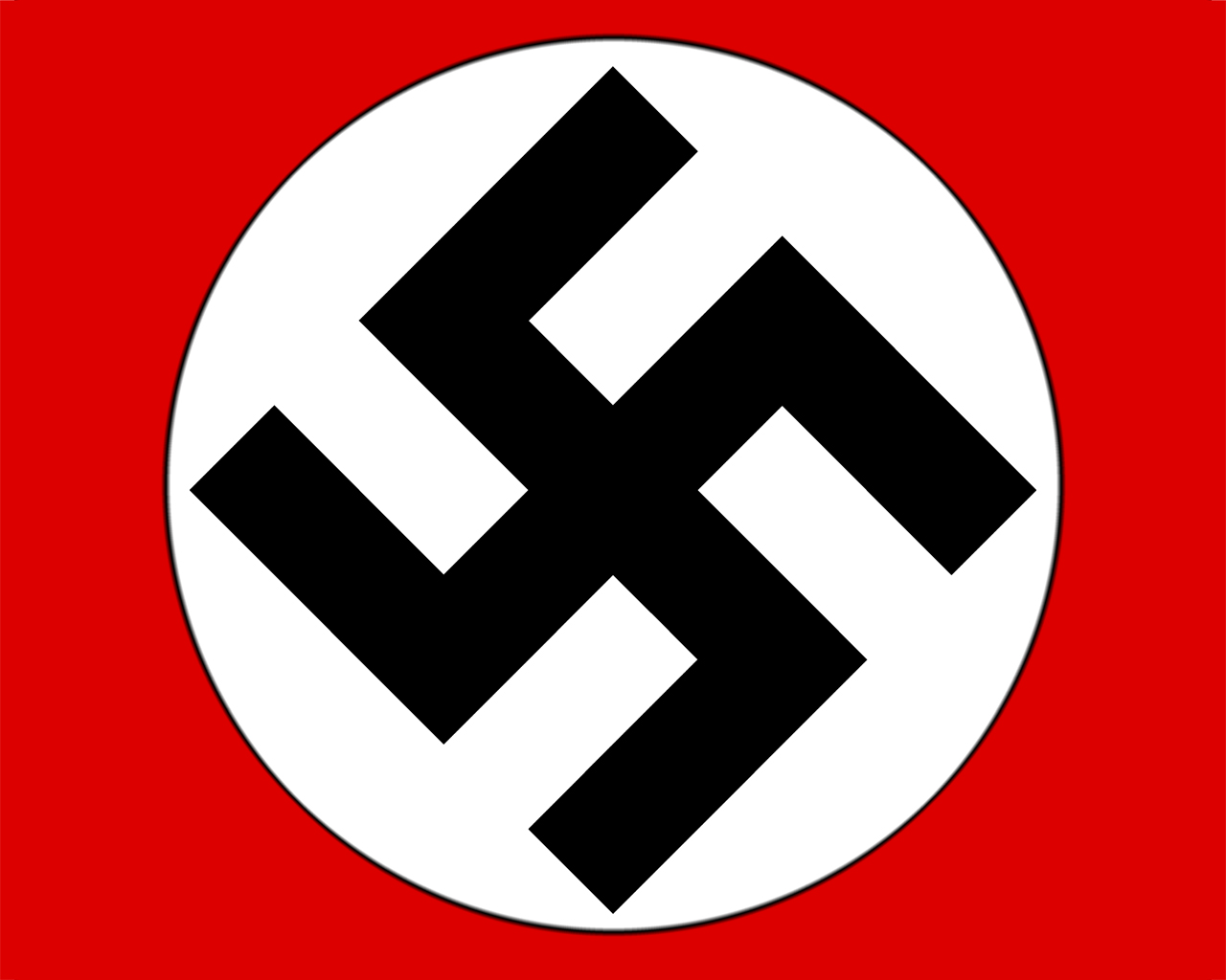
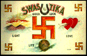 zi era in 1945, the symbol would never be able to shake off the stigma it had received. The only way this could ever be possible is if one were top rewrite history eliminating easily one of the most controversial icons known to man. There have been attempts to revitalize the swastika as a more peaceful sign as evidenced by the depictions below, one being an non-Nazi swastika and the other part of
  a sign used in an attempt to stop the E.U.C. ban on the use of the icon (artists/date unknown).
 icon itself has been tossed around for decades. Intended to be a composite of the letters "N" and "D" the overall form resembles that of a runic symbol. The runic symbol appearance is of great interest as during the reign of Nazi Germany the vast majority of runic symbols directly (in one way or another) related to Hitler and his army. Touching on the Hitler notion, one must also realize that signs and symbols can easily be transformed to
 mean good OR evil, so it's also possible that the icon could used for bad, although very very unlikely.
 nd interpretations to the design.

 Paper Bombs:
 The use of leaflets during wartime has been a vital tool for many decades. Many such posters are used for propoganda, attempting specific parties to side with one side or the other.
 Images:
German magazine published weekly from April 1896 through 1967, with a hiatus from 1944-1954. Upon 1964, the publishers decided to rethink its strategy becoming a biweekly in 1964.
Combining brash and politically daring content, with a bright, immediate, and surprisingly modern graphic style, Simplicissimus published the work of writers such as Thomas Mann and Rainer Maria Rilke. This anti-clerical cartoon is another image that was posted in the Simplicissimus at another point in time, the artist(s) at this point are unknown.
 routinely used for news and propoganda purposes, until the acquiring of this art movement but not until it was utilized solely as a propoganda item in relation to German forces.


